Friday 1 April 2011

A Farewell Post...

To The Examiner,

I hope you have enjoyed reading my blog and seeing the journey to my final magazine cover, contents page and double page spread. I have labelled all of my posts to make it easier for you to navigate around the blog, these are on the right hand side of the page.

I have spent many hours working on my coursework blog to try and make it the best i can, i also spent alot of time on research, planning, and experimenting with the new technologies i was introduced to, and i hope you can see this from looking through my posts. I feel i have progressed massively throughout the task, and that all my hard work had paid off, i also feel i have become more confident in using different technologies and have learnt alot from it!

Enjoy marking my blog, :)

Katy x

Tuesday 8 March 2011

Plan of action for necessary improvements...

Change Colour Scheme- Done
Make Interview Longer- Done
Change Title Colour- Done
Make Logo- Done
Improve Contents Page- Done
Change Image On Front Cover- Done
Less Glastonbury Mentions Throughout- Done
Make Picture and Alice Mumford link more Obvious- Done
Contents Page Needs To Have More Than 2 Images- Done

Saturday 5 March 2011

Logo...

I have now decided, after re-doing all of my drafts and looking for the best place to put it, that my logo will just be a simple letter C followed by an exclamation mark and it will be right next to the page number on every page, i think it's simple and will look good and it isn't very big so it won't clutter up my page. It will be noticeable though!

Friday 4 March 2011

Idea's for my logo...


For my logo i was thinking of having a continuous thin strip across the top of every page or at the bottom, i'll need to have a play around with it, and then having C! in red or gold to make the logo stand out, i think it would create more pronounced continuity within my magazine and make it flow better.

Potential fonts-

Covers who's images don't give eye contact...


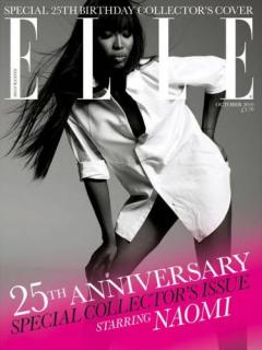
I think that all of these magazine look professional and have been very successful and i think that all of the main images look great even though they weren't making eye contact with the camera, i think the main probelm with my image is the fact my model's braces are on show, i thought the image looked good and you can't really notice the braces but evidently, the exam board are looking for magazines which look as good as the ones on the shelves. I got these images from cover junkie and there are hundreds more covers with the main image not making eye contact with the camera, but for my magazine and the genre i think there needs to be some connection between the picture and the audience to make it look professional.