Friday, 1 April 2011

A Farewell Post...

To The Examiner,

I hope you have enjoyed reading my blog and seeing the journey to my final magazine cover, contents page and double page spread. I have labelled all of my posts to make it easier for you to navigate around the blog, these are on the right hand side of the page.

I have spent many hours working on my coursework blog to try and make it the best i can, i also spent alot of time on research, planning, and experimenting with the new technologies i was introduced to, and i hope you can see this from looking through my posts. I feel i have progressed massively throughout the task, and that all my hard work had paid off, i also feel i have become more confident in using different technologies and have learnt alot from it!

Enjoy marking my blog, :)

Katy x

Tuesday, 8 March 2011

Plan of action for necessary improvements...

Change Colour Scheme- Done
Make Interview Longer- Done
Change Title Colour- Done
Make Logo- Done
Improve Contents Page- Done
Change Image On Front Cover- Done
Less Glastonbury Mentions Throughout- Done
Make Picture and Alice Mumford link more Obvious- Done
Contents Page Needs To Have More Than 2 Images- Done

Saturday, 5 March 2011

Logo...

I have now decided, after re-doing all of my drafts and looking for the best place to put it, that my logo will just be a simple letter C followed by an exclamation mark and it will be right next to the page number on every page, i think it's simple and will look good and it isn't very big so it won't clutter up my page. It will be noticeable though!

Friday, 4 March 2011

Idea's for my logo...


For my logo i was thinking of having a continuous thin strip across the top of every page or at the bottom, i'll need to have a play around with it, and then having C! in red or gold to make the logo stand out, i think it would create more pronounced continuity within my magazine and make it flow better.

Potential fonts-

Covers who's images don't give eye contact...


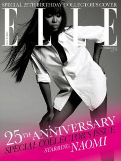
I think that all of these magazine look professional and have been very successful and i think that all of the main images look great even though they weren't making eye contact with the camera, i think the main probelm with my image is the fact my model's braces are on show, i thought the image looked good and you can't really notice the braces but evidently, the exam board are looking for magazines which look as good as the ones on the shelves. I got these images from cover junkie and there are hundreds more covers with the main image not making eye contact with the camera, but for my magazine and the genre i think there needs to be some connection between the picture and the audience to make it look professional.

Teacher Evaluation Feedback...

The levels i got for my research and planning and my practical draft were a low level 3, i wasn't too pleased with it but it gives me alot to work on and improve. I was told my colour scheme needs to be more pronounced and was advised to use red instead of pink, at first i really didn't like this idea but after playing around with colours etc, i started to like it, so now my colour scheme is black, red and gold, which i think looks classy and professional and isn't too girly. I don't like the idea of putting the title of my magazine 'compilation' in red, i think that would completely throw off the continuity of my magazine and make it look too red. My image isn't strong enough, which i'm gutted about because i love the front cover picture! It was mainly because she isn't looking directly into the camera and her braces are on show, i wouldn't have thought this would've been a problem but as my magazine is supposed to look as good as one on the shelves, the picture has to go. I'm going to look on cover junkie to see what covers i can find with the main image not having eye contact with the camera and then seeing how good it looks, as i think with the right angle and genre i think it could look really effective. I need to make the link between my main image and the name of the artist stronger as there is no obvious connection between the two, so i am currently re-doing my contents and front cover as they were both weaker than my double page spread.

My double page spread was the strongest out of my three drafts but the article needed to be alot longer and i needed more columns to balance out the page, i referenced some fashion in the top left corner which said what my artist was wearing and who it was by, apparently i need to make more references to the fashion but i didn't really understand what that meant. My picture 'needs' to be in colour, but i like the fact it's in black and white as i think it looks effective and goes well with my colour scheme, also the title of my article is 'Wild Child' which i quoted from the article, i was critisised on the fact my image was wild enough which i didn't think mattered but i can understand where my teacher was coming from as the image doesn't really show anything about her personality, as the title does, so i'm also working on finding a better image which shows a bit of a 'wild' side.

My contents admittedly was the weakest out of my drafts, the font doesn't flow with the rest of the magazine, there were only 2 images which looked so out of place, my title still had the pink O which i had previously deleted on my front cover, so there was no connection and it confused some of my peers when they were evaluating it, i've completely re-done my contents and changed the whole colour scheme of my magazine, so it now flows and looks much more professional, i've been looking at different styles of magazines for example- fashion, music and even travel magazines to see how they make their contents pages flow and how they lay them out, i think now my contents looks much more appropriate for my target market and looks more like it belongs in my magazine, whereas before, there wasn't much continuity and it dodn't gel together very well.

Overall i'm happy with the feedback i had, even i did think some of was a little bit harsh but it's all constructive and has made me change my magazine for the better.

Peer Feedback...

'The parts all fit together well, though i'm not sure why you didn't put any of the pink on the front page- especially on the logo as you have used that on your contents. The fonts really fit the genre, and I love the angle of the photo on the front cover and how it's put together- looks professional :)'

'I like the continuity in the magazine with the colour scheme of pink and black, they go well together and are elegant which relates to your target audience of young women. The picture effects on the double page spread also look really elegant and pretty, so that works well! The only things I would say are the DPS font is quite small and you can't read it. Also the front cover is very muted and doesn't really seem to fit with the pages. Other than that it looks really good!'

'I love the colour scheme I think that goes really well for the target audience. All the images look really professional and good too. I like the layout of the DPS - there's colour and lots to look at.'

I was really happy with this feedback because it said exactly what i thought about not using the pink on my front cover as i did in my contents, this only happened because i was rushing to get my draft finished and completely forgot to edit my contents page. I'm completely redoing my colour scheme and changing the layout of my front cover and contents so it looks more professional. All the critisism i got was constructive so i can definately work on what my peers think didn't flow well or look right.

Saturday, 26 February 2011

Questionnaire for my Target Audience...

1) Would the front cover catch your attention? If yes, why?
2) Is the content of the article interesting? 
3) What else would you want to know in an article? Is there enough information
4) Is the contents easy to navigate?
5) Do the images catch your eye, and look professional?
6) Do the pages bode together? 
7) Do the chosen fonts look professional?
8) How much would you be prepared for this magazine?
9) Does the colour scheme fit the genre of the magazine and is it appealing?
10) What would you change to improve my magazine?

Thursday, 3 February 2011

Test Shots...


Out of the many hours and many clothes changes, these are the shots i would highly consider using for my magazine, i think they all reflect the personality of my magazine and my artist perfectly and i think they all look really good and my model looks happy and comfortable which is what i wanted! i really like the contrast of the poses, as there are some with a straight face, then a smile and even laughing, which is exactly what i wanted for my pictures.